
Lingo to know
Expert - Individual with vast competence, knowledge, and skill accumulated through years (at least 5) of experience and consistent practice in their outdoor activity of choice.
Enthusiast - Individual with an amateur, hobbyist level of competence, knowledge, and skill whose experience is limited to a short amount of time or a long amount of inconsistent time engaging in the activity.

Area of opportunity
O1: The enthusiasts
😓 Pain points:
Countless hours researching vital information to participate in popular activities such as hiking, climbing, fishing, biking, and skiing
Overwhelming search for reliable information
O2: The experts
😐 Pain points:
Lack of easy ways to monetize expertise
Need for extra income
Lack of control over schedule

How might we…
Empower enthusiasts to confidently pursue every outdoor adventure and enable outdoor experts to give back and earn more?
Let's explore! Time for a little research.
Competitive analysis
Provides deep insights into the market and what's already available to users
Reveals common UI patterns
Can inspire important design decisions
🔑 Key takeaways
💪🏼
Strengths
Common UI Patterns: Ensure the app uses familiar UI patterns for a seamless user experience.
Distinctive, Targeted Brand Experience: Develop a unique and focused brand identity that appeals specifically to outdoor enthusiasts and experts.
Question Suggestions in Chat: Incorporate feature to suggest relevant questions in the chat, enhancing user engagement and support.
👎🏻
Weaknesses
Unclear Navigation Headings and Organization: Ensure app’s navigation has clear headings and a well-organized structure.
Experience Lags and Glitches: Design with potential performance issues in mind to ensure a smooth user experience.
Information Reliability: Ensure the information provided is accurate and reliable.
Limited Cross-Device and System Compatibility: Ensure compatibility across various devices and systems.
Interviews
Why in person interviews?
Reveals critical user insights
Allows for open ended discussions + follow-up questions
Ability to observe non-verbal cues
let's use our research to inform our…
Utilizing interview insights when they seem disjointed.
Organizing a large amount of info into something of value.
Gaining deeper understanding of the mind and actions of users.
Organized the information into an affinity map, which I then used to create user personas & user journey map.


🧠 ⛈️
Challenge
Approach + process
👆🏼👉🏼👇🏼👈🏼 😰
Challenge
Approach + process
🂩 🗂️ 🏃🏼♀️➡️
Challenge
Approach + process


let's get sketchy: using structure to inform design
🧠 🏃🏽♀️➡️ ✍🏼 ✏️
Challenge
Approach + process


🕵🏼♀️ 📲
Challenge
Avoiding introducing bias in usability testing prompts
Approach + process
I made sure to use neutral language
Focused on tasks
Sought peer reviews and iterated based on feedback
🚫 📊
Challenge
Deciding what usability errors to prioritize
Approach + process
Assigned severity ratings
Focused on user impact
Analyzed the frequency of occurrence


Sign up flow
The issue ⚠️
Users tapped 'log in' before 'sign up' when prompted to create an account
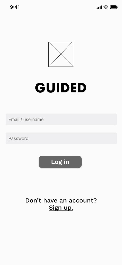
The the fix 🔧👍🏻
Changed wording to 'Create an account'
Prioritized 'Create Account' as the main CTA
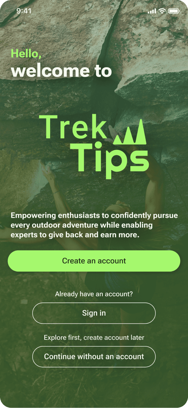
Why❓
Prioritized 'Create Account' as the main CTA, since most returning users will already be signed in, making account creation a higher priority.
"Sign Up" can be perceived as a quick action, often associated with subscribing to a newsletter or limited features. In contrast, "Create Account" implies a more comprehensive setup, including a detailed profile. This change sets clear expectations, enhances perceived value, and reduces ambiguity for users.
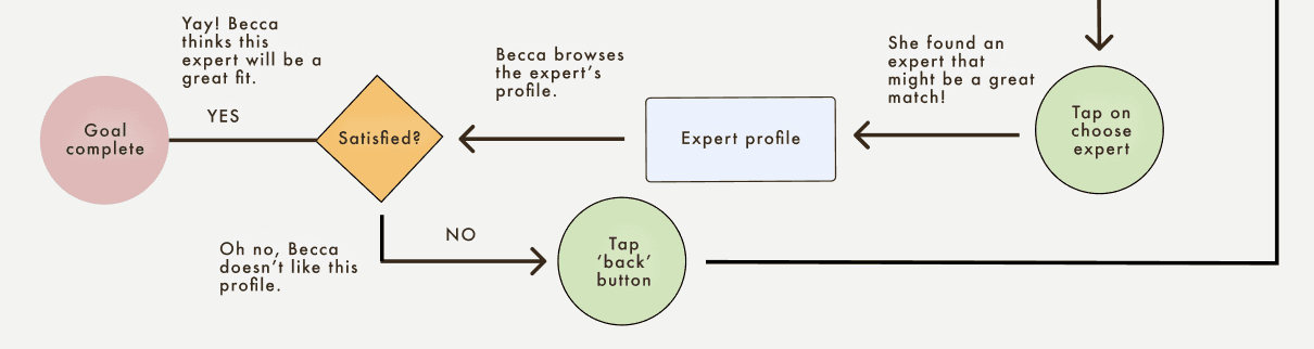
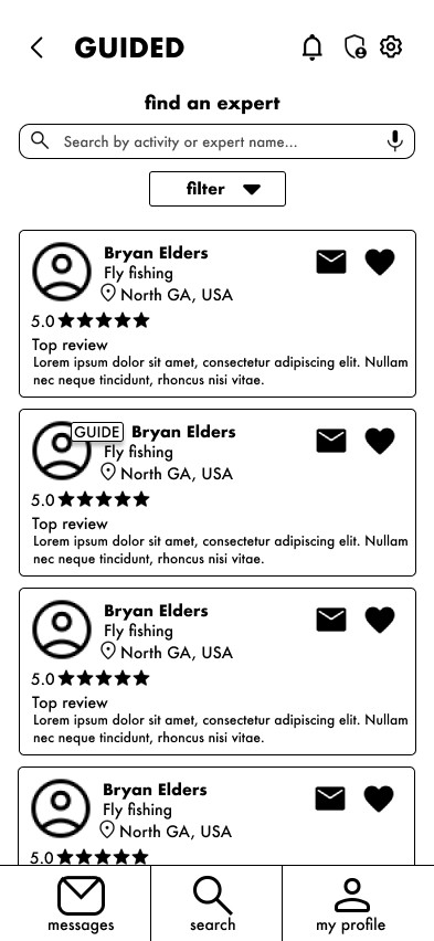
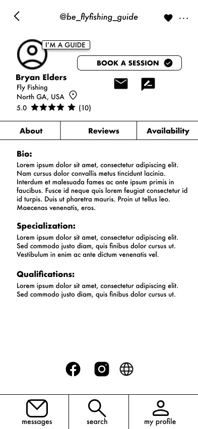
Search flow
The issue ⚠️
Users tapped 'Browse our expert guiding partners' button on bottom of screen to search experts
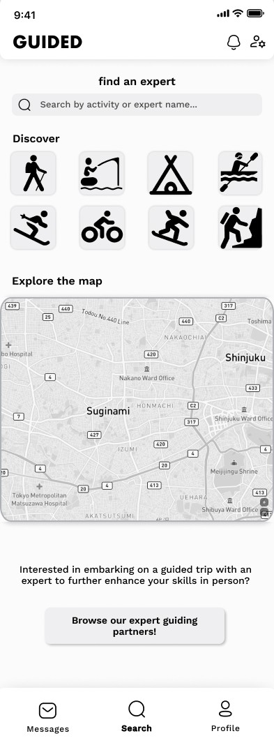
The the fix 🔧👍🏻
Changed name of app to TrekTips
Designed more comprehensive section about guides
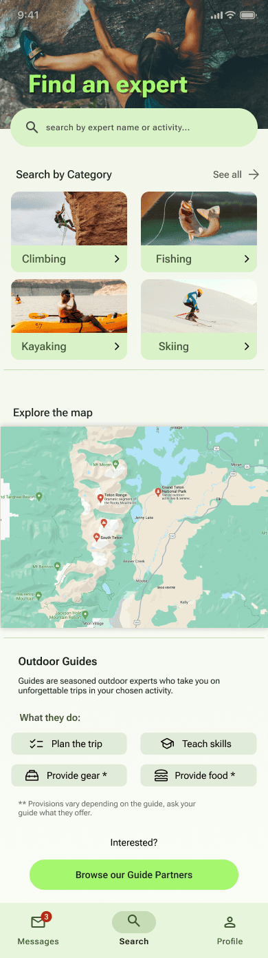
Why❓
I changed the app name because users were mistakenly thinking every expert was a guide due to the app being called "Guided." The new name eliminates this confusion and clarifies the role of the expert.
To reduce confusion about what a guide is, I added more detailed information to provide clarity for users.
Schedule a call flow
The issue ⚠️
Users were hesitant about where to tap when asked to schedule a call with an expert
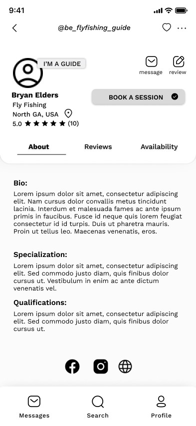
The the fix 🔧👍🏻
Changed wording to 'Schedule a call'
Turned into a FAB
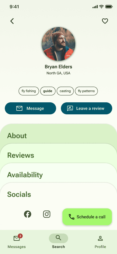
Why❓
Changed the wording to "Schedule a call" for clarity, as it directly represents the action taken. The term "session" was ambiguous, while "Schedule a call" precisely describes the user's action.
Changed static button to a Floating Action Button (FAB) to highlight the primary action and increase its visibility and accessibility. The FAB's prominent placement and distinct design make the interface more engaging and space-efficient.


This project provided valuable insights into the entire design process, including the intricate details of human-centered design. It presented numerous challenges, many of which I have discussed above. Through these experiences, I identified several key takeaways that will inform my future design work.
Thorough research is crucial for making informed and effective design decisions. The more comprehensive the research, the stronger the foundation for creating user-centered solutions and justifying design choices.
Collaboration is essential in the design process. Engaging with others brings diverse perspectives and insights that can uncover opportunities and solutions I might have overlooked on my own.
No design process is one-dimensional or strictly linear; each project has its unique trajectory. This project followed a linear design process due to the course requirements, but I recognized numerous instances where iterating and revisiting certain stages would have been highly beneficial. Embracing flexibility and adaptability in future projects will enhance the overall design outcome.
