
UX / UI Design hackathon case study
How might we…
The team
My role, UX / UI designer
Dani, UX researcher
Savannah, UX designer
Connor, UX / UI designer
Tools
Figma
Adobe Photoshop
Adobe Illustrator
Duration
48 hours

Pain Points
⏰
Without complete knowledge of the past and future, users have a difficult time knowing where and when to travel.
❌
Users lack familiarity with time travel technology creating a barrier to entry.
🚧
Time travel is a very innovative technology that lacks a standardized and safe method of travel.
How might we…
How might we design an intuitive, engaging platform that educates users on safe time travel and helps them discover ideal destinations and events, making time travel accessible and enjoyable for everyone?
Competitive Analysis


Common Features
Explore page
Map view
Search by location or date
Suggested or trending experiences
Strengths
Compelling imagery
Social components
Elements of modern culture and immersion
Expansive search features
Weaknesses
Lack of instruction on certain travel and safety protocols
Lack of features for historical and educational travel
No existing experience for time travel
Drew on Nielsen Norman’s heuristic of familiarity, a well established usability principle.
This strategy leveraged familiar design elements to reduce the learning curve and cognitive load, ensuring a seamless user experience and smoother adoption of the technology.
Task flow
Homescreen
Signup/ Login
Results
Time Details
Trip Wrap-Up
Spawn Spots
Map
Locations
Dining
Friends
Number of ppl
Duration
Real-Time Logistics & Abort button
Search
Start Booking
Begin Trip
Abort Trip
Timer runs out
Splash screen
End
Search
Trip booking
Abort trip
Search
Designed clickable pills to highlight featured periods, a ‘Popular Times’ section, and an intuitive timeline for exploring events by location. Added a search bar for users to quickly find specific times and locations.
Clickable pills and ‘Popular Times’ section enhance engagement by surfacing frequently searched periods, giving users quick access to key information.
The timeline navigation mirrors familiar map search features, leveraging user habits for a natural and intuitive event exploration experience.


Trip Booking
Streamlined the booking process to four key inputs: location, date, duration (with a scrollable selection), and number of travelers. Designed a prominent green 'Book Now' button and a trip summary screen for a clear booking overview.
Reducing booking to four inputs minimizes user friction and speeds up decision-making.
The green 'Book Now' button prompts immediate action and utilizes clear CTA phrasing.
The summary screen ensures accuracy and boosts user confidence before booking.

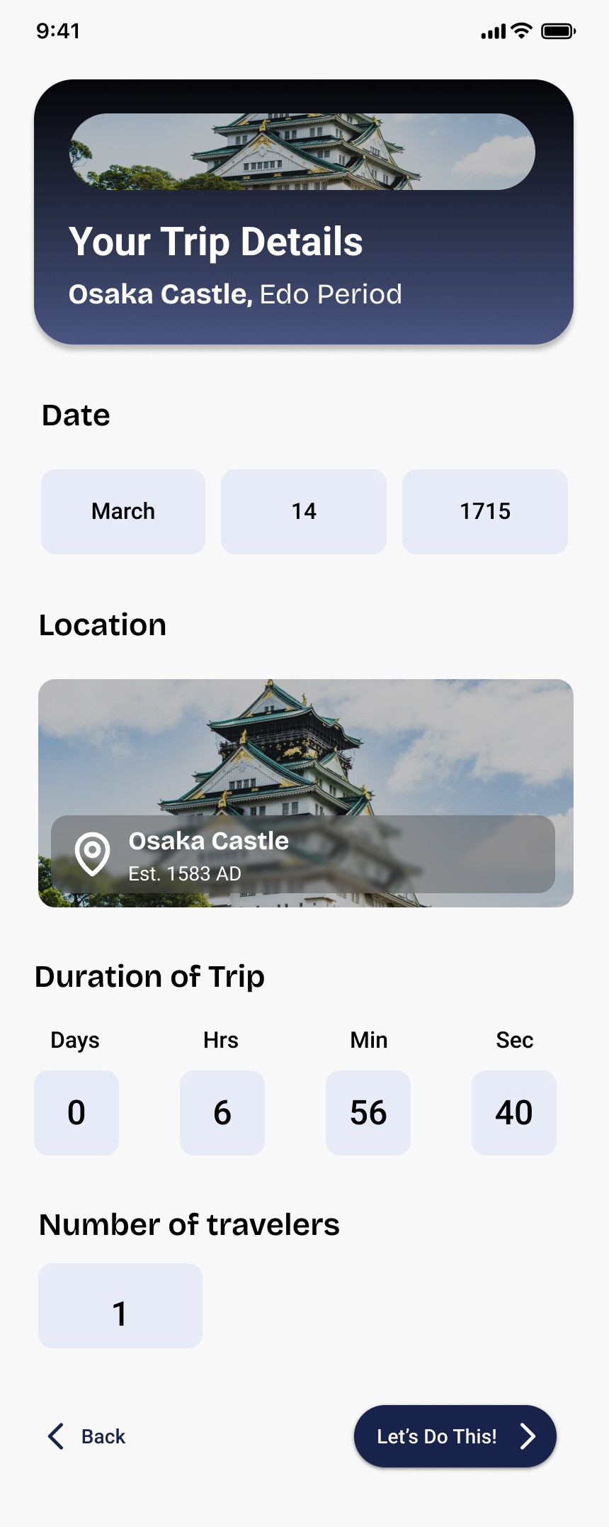
The scrollable duration feature is often inefficient, error-prone, and less accessible. A button increment system with direct input fields offers quick, familiar adjustments and precise entries, optimizing space and enhancing usability compared to manual scrolling.
The current button phrasing for confirming bookings is vague and lacks clarity. I recommend using more direct and action-oriented labels like “Confirm Booking” to clearly convey the intended action.
Abort trip
Positioned a prominent circular button at the top of the screen, utilizing a bright green color

This function was integrated for safety purposes, allowing users to end their time travel trip early if needed.
Button at top of screen makes it easily accessible.
Large, bright green button was designed for high visibility and easy access, making it instantly recognizable as the abort trip control.
Circular shape draws attention, while the green color enhances contrast, ensuring quick, intuitive action in urgent situations, prioritizing user safety.
I would use a red color to better represent the urgency of the action, signaling an emergency and conveying the critical nature of the decision. Additionally, labeling the button as “Abort Trip” would make the functionality explicitly clear to the user.


