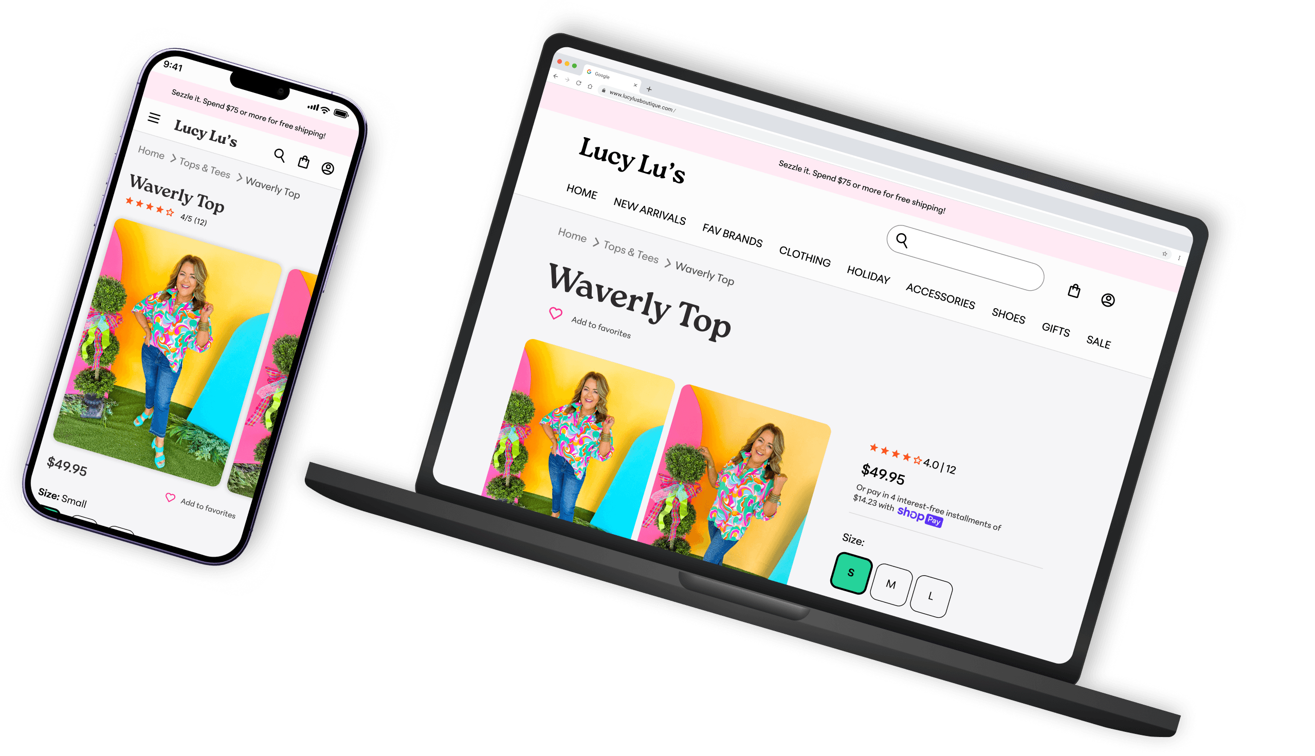
How might we…
Shopify KPI insights
74.56% of online sessions are mobile
Mobile 1st design
Average order value = $95.68
Increase by offering personalized cross-selling options at checkout
Top landing page by session = home page
Prioritize homepage design to create strong first impression + strategically leverage CTAs to drive user engagement and conversions
60%
30%
10%
Women ages 25-55
Local to the Southeast United States
Casual, upbeat, encouraging. Like chatting with a best friend.
Key improvements
Decrease page density - improves readability, usability, + increases conversion rates by having less clutter and simplifying navigation
Strategically place CTAs on homepage - enhances user engagement, guides visitors towards desired actions, and increases conversion rates by ensuring high visibility and easy interaction
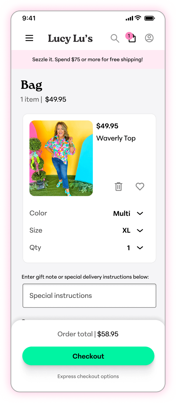
Product recommendations at checkout - increase average offer value, personalized shopping experience enhancing user satisfaction
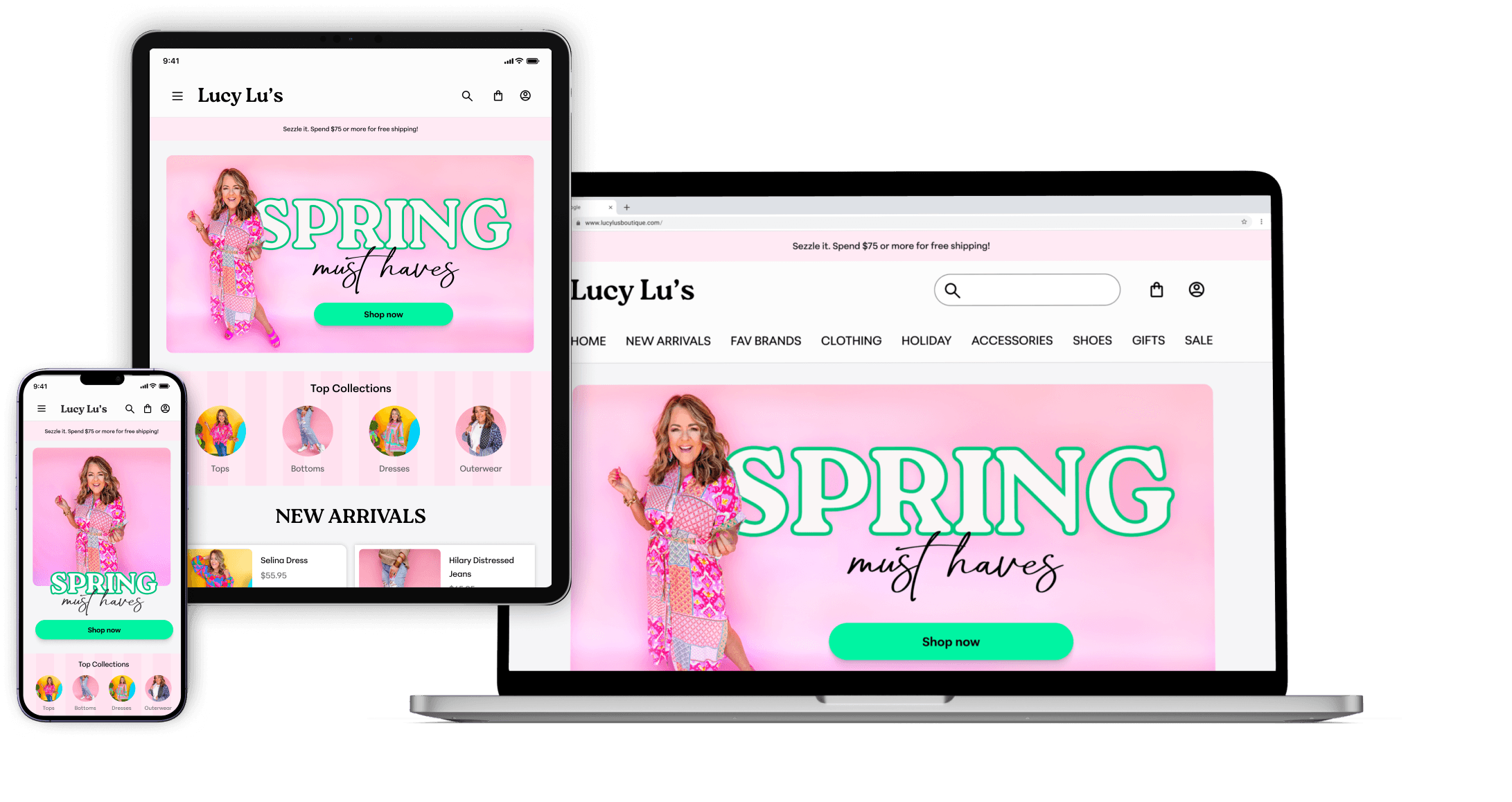
Optimize design for mobile

Jane Smith
“With three kids, I am on the go. When I get a moment for me, I love setting aside time to have brunch with my best friends.”
Age: 32
Occupation: Middle school teacher
Location: South Carolina
Activities: Baking and watching favorite TV shows
📚 User stories
Painpoints
Needs + goals
Device + Internet Usage
Mobile
Desktop
Technical proficiency
Social
⚠️ Challenge
💡Approach + process
South Eastern United States
59%
Other
41%
Shopify analytics - location
Instagram analytics - gender
Review persona + user stories + data
Identify functionality that addresses needs
Prioritize based on importance + impact
Ensure alignment with business goals + objectives
Key benefits:
For Jane
Eliminates redundancy
For the business
Key benefits:
For Jane
For the business
Valuable insights to refine marketing strategies
Key benefits:
For Jane
Personalized experience
Quickly recall products of interest
For the business
Fosters loyalty + customer satisfaction
Valuable insights to refine marketing strategies and offerings
Key benefits:
For Jane
Informed purchase decisions
Increased trust
For the business
User needs
+
Business needs
+
Visual design
Wireframe iterations
⚠️ Challenge
Iterating on wireframes with limited research + testing options
💡Approach + process
Developed initial wireframes based on available data and understanding of user needs
Stepped back to critically evaluate designs to see them from different user perspectives
Consulted UX design mentor for design feedback
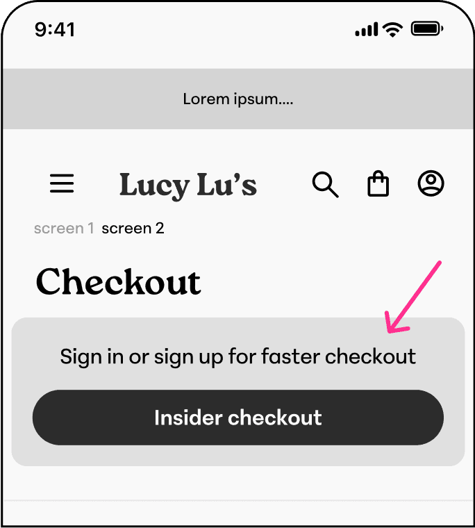
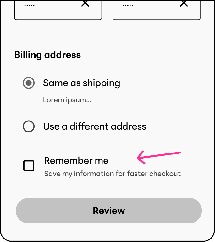
✅ Final Design
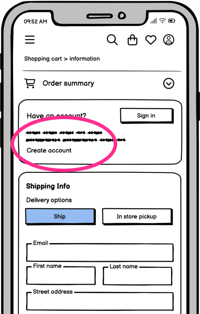
Consolidating sign-in and sign-up options streamlines user action into a single decision
Clear phrasing
Implemented action to allow the system to retain user information without requiring account creation
✅ Final Design
Recommendations at checkout
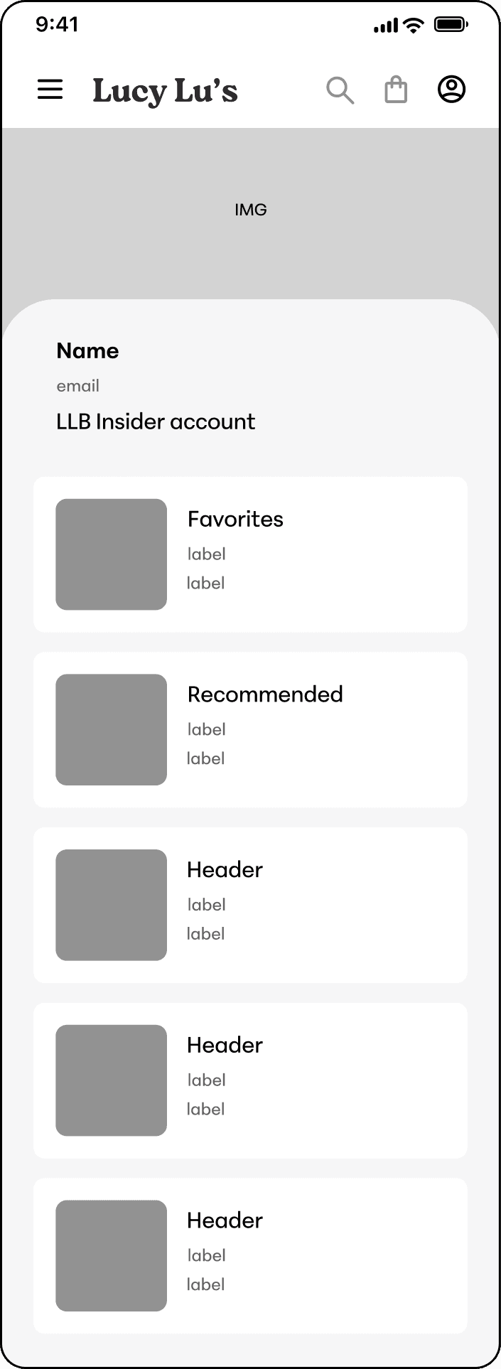
Recommended products on account screen
✅ Final Design
Save products from product screen + recommended products
Favorites saved in account
✅ Final Design
Implemented product details dropdown
Dropdown makes design simple + minimizes cognitive load
Review summary + detailed reviews on product screens
Grid system
⚠️ Challenge
Maintain a consistent and cohesive layout across devices
💡Approach + process
Assessed industry standards, popular frameworks, + their advantages
Evaluated project design requirements
Opted for a 12-column grid system due to its scalability, flexibility, and cohesive design capabilities, as well as its compatibility with widely-used frameworks like Bootstrap
24px margin
16px gutter
4 columns
XS Breakpoint
24px gutter
32px margin
6 columns
Small Breakpoint
32px gutter
78px margin
12 columns


